

NLP Tool
A dashboard solution that takes in survey comments and surfaces themes, sentiment analysis, and data visualizations
Problem
IBM is a massive company with over 250,000 employees and has a culture that encourages surveys, polls, feedback, and data gathering to improve every area of the business. Surveys are conducted both internally for employees and externally for IBM’s clients and products. Many of the surveys and polls have some open ended questions where people can input textual feedback. The number of comments varies by survey size, some surveys have only a few hundred comments while others have hundreds of thousands of comments.
Comments were being analyzed manually if the survey was small enough. This process was time consuming and full of human error. When a survey size was too large, a request was sent to the data science team to run a script that analyzes all comments in an excel file and outputs an excel file with top themes based on sentiment scores. Overtime, it became harder for people to manually read comments and for data science teams to keep up with the sheer number of requests. Surely, there must be a way to make this process easier?
What if we could automate what our data scientist do and create a platform that allows anyone to upload comments and see a dashboard of results?
My team set out to research, strategize, and design an end-to-end Natural Language Processing Tool that helps IBMers analyze survey comments in a manner that is self-service and quick.
My Role
Over the course of a year, I led the research and design work to create an MVP solution in collaboration with data scientists, engineers, product managers, and executive stakeholders.
Cross-Functional Team:
1 Senior Designer (me)
3 Software Engineers (front and back end)
1 Lead Data Scientist
1 Product Manager
1 Offering Manager
2 Executive Leaders
Understanding the User
There are two main types of users our team focused on for the MVP of the NLP tool.
HR Partners: Responsible for helping VPs and SVPs analyze survey feedback and help implement organizational changes based on the feedback.
Data Analysts: Responsible for analyzing data and passing on any insights to the HR partner.
A frustrating and convoluted experience

Pain Points:
Dependency on other people and teams to get the work done.
Back and forth communication that causes delays.
No standardized process to analyze comments.
Opportunities:
Enable a self-service model to reduce dependency on others.
Save users’ time and business resources by automating the process.
Increase the accuracy of data analysis by reducing the need for manual comment analysis, which causes human errors.
The Process
Conducted user interviews to understand user pain points, needs, and opportunity areas.
Mapping out the as-is and to-be user journeys
Creating wireframes to quickly explore various design ideas
Iterated on mid to high fidelity design concepts
Created a prototype to conduct usability testing
Refining designs based on user feedback
Handoff to developers and close collaboration during development
From Insights To Designs
To truly understand the major challenges our users faced, I conducted user interviews with 10 users total, 5 HR partners and 5 data analysts. Some of the things we wanted to understand were:
The number of data reports they had to work on per month.
The challenges they faced in their current workflow.
What tools or features would help them do their jobs better and faster.
How they work and who they collaborate with.
Insight #1: Most of our users lack data knowledge and don’t know where to start.
Based on these insight, we wanted to make it easy for our users to:
Know exactly where they need to go
Access resources that will help them get started and learn more about data and our NLP tool.
During user interviews, we discovered that some users were brand new to analyzing survey comments, while others were extremely familiar with analytics. We also learned that some of our users analyze comments once a quarter while others analyze comments 2-3 times per week. Given varying degrees of comfort with data, our solution needed to be adaptable, allowing users at any skill level to easily utilize the NLP tool.


The landing page was designed to quickly guide users to specific tasks that help them accomplish their goals. Users can start a new data analysis, check results from a previous visit, or learn more through our resources.
The resources page allows users to view an animated video on how to use the tool, access a pdf with instructions, and download an excel template to ensure their survey comments are uploaded in the correct format for our NLP tool to process.
Insight #2: Data and reports must be filterable to allow for intense customization.
Both HR partners and data analyst often analyzed data for multiple business units, geos, and markets. Therefore, they needed the ability to customize the type of data breakdowns and filters in order to create insight reports for their VPs and SVPs.
At a company the size of IBM, there are thousands of data points. We asked users which filters were most and least important in order to prioritize which filters would be included in the NLP tool. The top most used filters were:
Business unit: the top functions/orgs at IBM
Geo: main geographical areas IBM does business in
Tenure: how long someone has been at the company
Market: top countries IBM does business in
Band: the job level someone is currently in
Time in Band: how long someone has been at their job level

Insight #3: Users expressed need to quickly export results and visualizations.
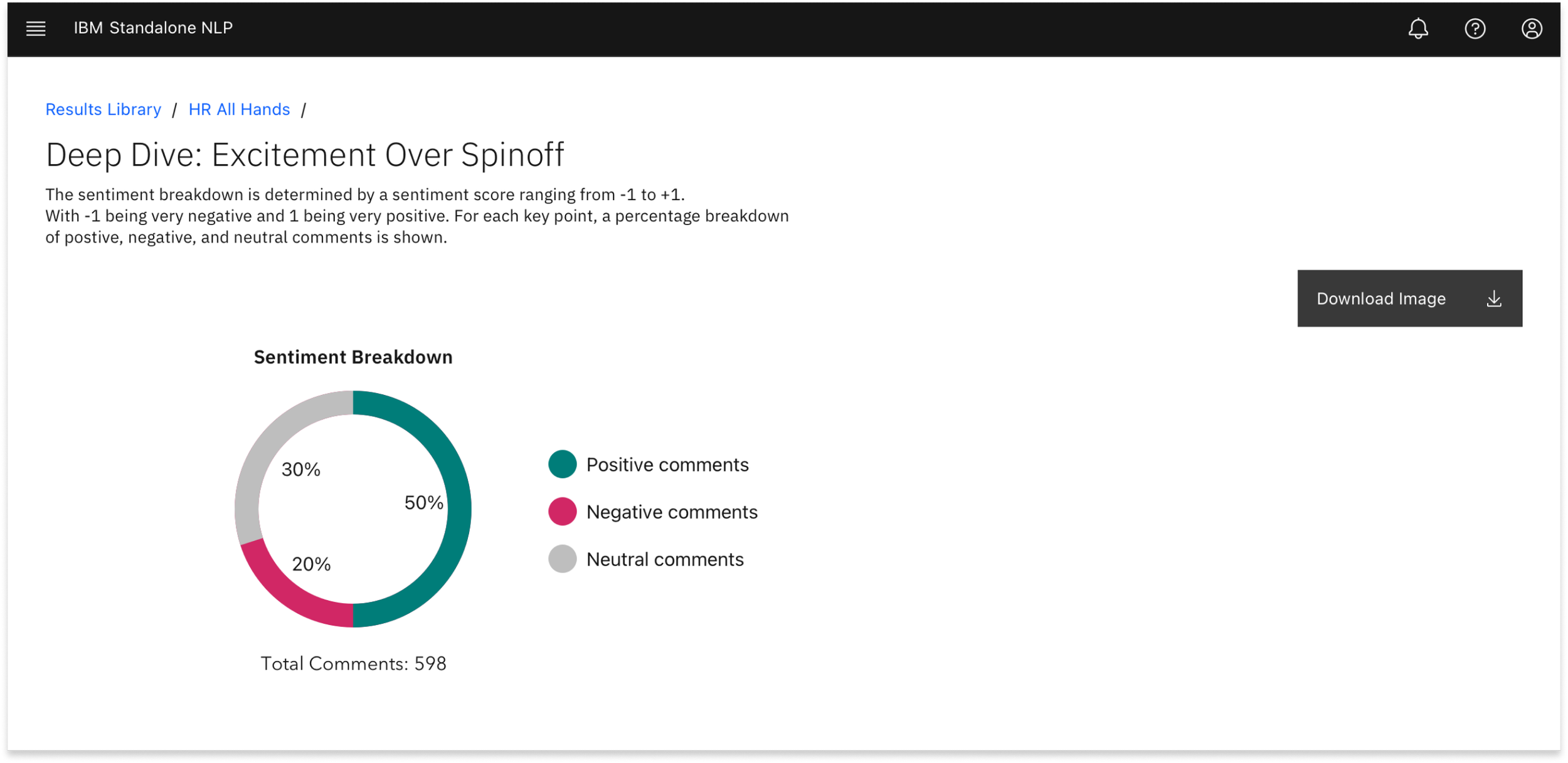
Users explained that after they complete analyzing the data, they often create PowerPoint presentations to share insights. They expressed the need to easily copy and paste visualizations from our tool, as well as download any data back into excel. Once we had a prototype, we tested different types of visualizations. The donut chart was the most popular and needed chart for our users. They liked how simple it was to understand and how useful it can be during their presentations.
Across the experience, users are able to download the following:
Data visualizations and graphs as .png.
Download any table that shows the key points and themes of all comments. This download is available as a .csv.
Download the data shown on the entire page.
Download a section of data.
Outcomes
We were able to move 90% of our clients to a self-service model. The remaining 10% were clients whose surveys contained confidential and sensitive personal data and could still request 1:1 help from a data scientist.
Clients had easier access to analyzing and truly understanding data, sentiment analysis, and what NLP is.
High NPS Score for our tool (55)